Rubbish logo in a fuchsia box and white text

Understanding People's Interactions with Litter for a Litter Tracking App


Rubbish is an organization that uses technology to create cleaner streets in communities. Anchoring Rubbish is their iOS app where users document and upload litter for Rubbish to analyze litter trends and provide communities with resources to relieve litter problems.

It wasn't clear to the team how users were using the app and if there were pain points using it. But the team was also curious about what types of features users would want to have in the app. Using in depth interviews and usability testing I lead research into how people felt about litter, and how they used the Rubbish app.


Research Statement, Goals, and Methodology

Rubbish had App Store reviews that reflected an appreciation for the concept of the app, but not so much about the experience and impact of using it.

To address the team's interest in what people wanted out of the app I felt it was important to understand users' encounters with litter, the impact it had on them, and where they perceived the litter problem coming from. I also wanted to learn more about how people used apps generally and what their expectations were for them.

Research subject:

People's encounters with litter and their use of apps.

Research statement:

We want to uncover people's interactions with litter to learn how our app's features and functionality can empower users to address litter in their neighborhood.

Learning goals:

  • Understand how litter impacts people, their perceptions of where litter comes from and how they envision solutions

  • Discover what apps people use regularly, why they use them, and how they use them

  • Evaluate the interface, flow and functionality of the Rubbish app and if there are pain points in using it


To learn about these things, I considered diary studies where people would describe their encounters with litter over time, but I was concerned about a lack of data as people at the time were confined to their homes because of COVID-19. Ultimately I did hybrid interview sessions with open ended questioning to learn about people's interactions with litter, and then usability testing to uncover how people interact with the app flow and interface.


Recruiting and Screening

Above all, we wanted to talk to people that were concerned about litter and the environment.

While litter exists everywhere, its concentration in urban environments made us want to speak to urbanites. And since tracking litter with the app relied on pedestrians, we wanted to make sure participants default mode of travel was not by car.

We also needed to ensure participants used apps outside of standard phone apps like email and weather, social media apps, or apps for work. It was important that we talked to people that would be interested and willing to download and use an app.

We posted the screener survey as a Google form in Craigslist and subreddits r/ZeroWaste and r/DeTrashed. Because the team didn't have budget to compensate all interview participants for their time, we entered everyone who took the survey into a raffle for a $50 Amazon gift card, and then entered the selected participants into another separate raffle for a gift card.

View the screener survey


The Interviews

I kicked off the conversations with some open ended research questions before moving into the app.

Open ended Interview

Some key questions and prompts:

  1. Describe what a good neighborhood is to you.
    • Tell me a bit about the neighborhood you live in
    • Describe some of the things you do in your neighborhood
    • Are there neighborhoods other than your own that you visit?
    • Take me through the process of leaving your neighborhood to visit another
  2. Describe to me what comes to mind when you hear the term "litter"
    • Take me through the last time you encountered litter on the street
    • Describe how it made you feel
  3. Describe to me how do you feel about using apps on your phone
    • Can you recall the last time you downloaded an app?
    • Take me through why you decided downloaded it
    • Describe what you did with the app
    • How did you feel about the app?
  4. Is there an app you use regularly?
    • Take me through why you originally downloaded it
    • Explain what you use the app for
    • Describe why you use this app so much
    • Is there anything you want to change about this app?

Prompt 2 was really important, but I used the first prompt as an ice breaker because I didn't want the litter question to influence their description of a good neighborhood. I felt learning about what defined a good neighborhood would help me uncover some of their core needs to exist comfortably in their community, which may nuance their descriptions about litter.

Usability Testing

Core to the testing was the primary flow of "Rubbish Runs." In Rubbish Runs, users start a timer, document litter over the course of a 'run,' and then stop the timer when finished. That data is collected by the app and users can view their run stats

We tested to see if users understood what the app was doing and what it was asking them to do during a run. We also asked them about specific UI elements and what their expectations were for them:

Now, continue walking down the street and when you see some litter show me how you would take a picture of it.

  • (Watch them take the action)
  • Is that what you expected to happen?
    • Explain to me what you think is happening on this screen
    • What does it look like you can do here?
  • Ok. Now, show me what you would do next.
  • (Watch them take the action)
  • Is that what you expected to happen?
    • (IF NOT) Describe what you expected
    • Explain to me what you think is happening on this screen.
  • Describe what you think is happening now
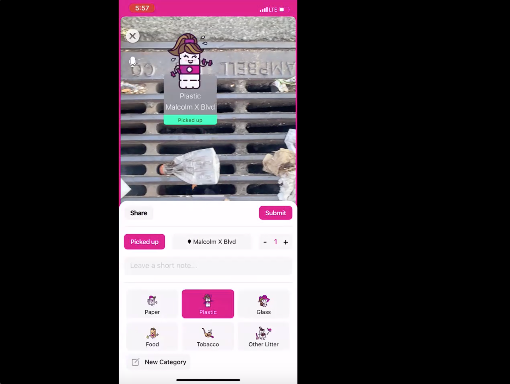
a screenshot of a usability test where the test participant is taking a picture of a plastic bottle on a sewer grate and documenting it as plastic

A test participant documenting plastic litter

The team was also interested in learning how participants felt about a newly launched perks program where users can get rewards from places like Starbucks and Sweetgreen for picking up trash. This is where I did some open ended questioning in the middle of the usability test.

Imagine you had received an email from Rubbish letting you know about "Rubbish Perks" where you can get rewarded for tracking litter by various businesses.

  • Show me how you would learn about those "Rubbish Perks" in the app
  • How you would expect to get involved in "Rubbish Perks?"
  • Tell me what you think about "Rubbish Perks"
  • Have you seen anything like "Rubbish Perks" in other apps?
    • (If yes) Tell me about that.
  • Do you participate in any other types of reward programs?
    • (If yes) Take me through how that program works.
    • (If no) Tell me about why not
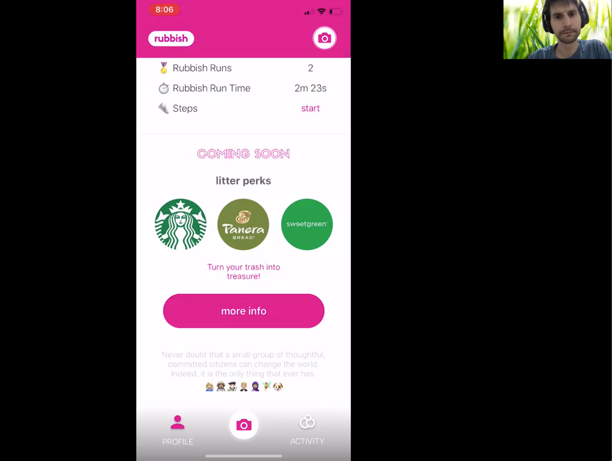
a screen shot of a usability test where the test participant is in the litter perks section of the app. There is a thumbnail of me moderating the test

A test participant looking at "Litter Perks"


Analysis, Synthesis and Output

I transcribed all the interviews into an excel sheet, with each thought entered into in a row. I then went through all the rows and labeled them as follows:

  • Pain point
  • Motivation
  • Need
  • Goal
  • Task
  • Tool
  • Core Value

I then created an affinity diagram, and a stoplight chart for the usability testing.

Affinity Diagram

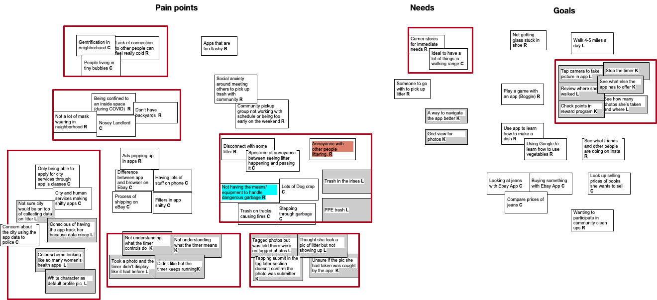
With all the thoughts labeled in the Excel sheet, I moved them into columns in an Omnigraffle canvas.

a part of an affinity diagram done in Omnigraffle with cards sorted in columns for pain points, needs and goals and red boxes bundling cards into themes

An affinity diagram made in Omnigraffle

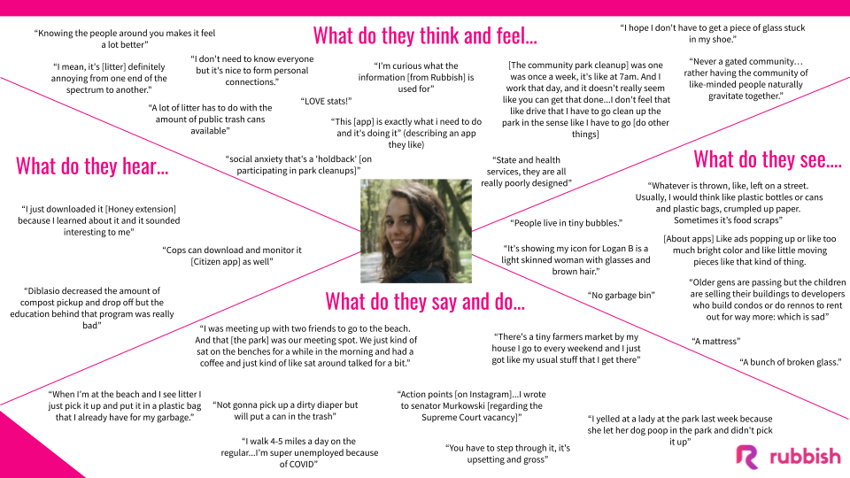
Key output from the affinity diagraming were an empathy map, and series of insights with How Might We Statements. The empathy map was a good way to ground the team in who their users are, what they do in their neighborhoods, and how they feel about litter. It reflected key themes that the team could meditate on.

an empathy map with four sections: what do they think and feel, what do they see, what do they say and do, and what do they hear. A picture of a young woman's face is in the middle of the empathy map

The empathy map gives a snapshot of the participants. Leaving this with the team provided a good starting point to think about users for future ideation and updates.

The insights were a really great tool to launch ideation about potential features.


Stoplight Chart

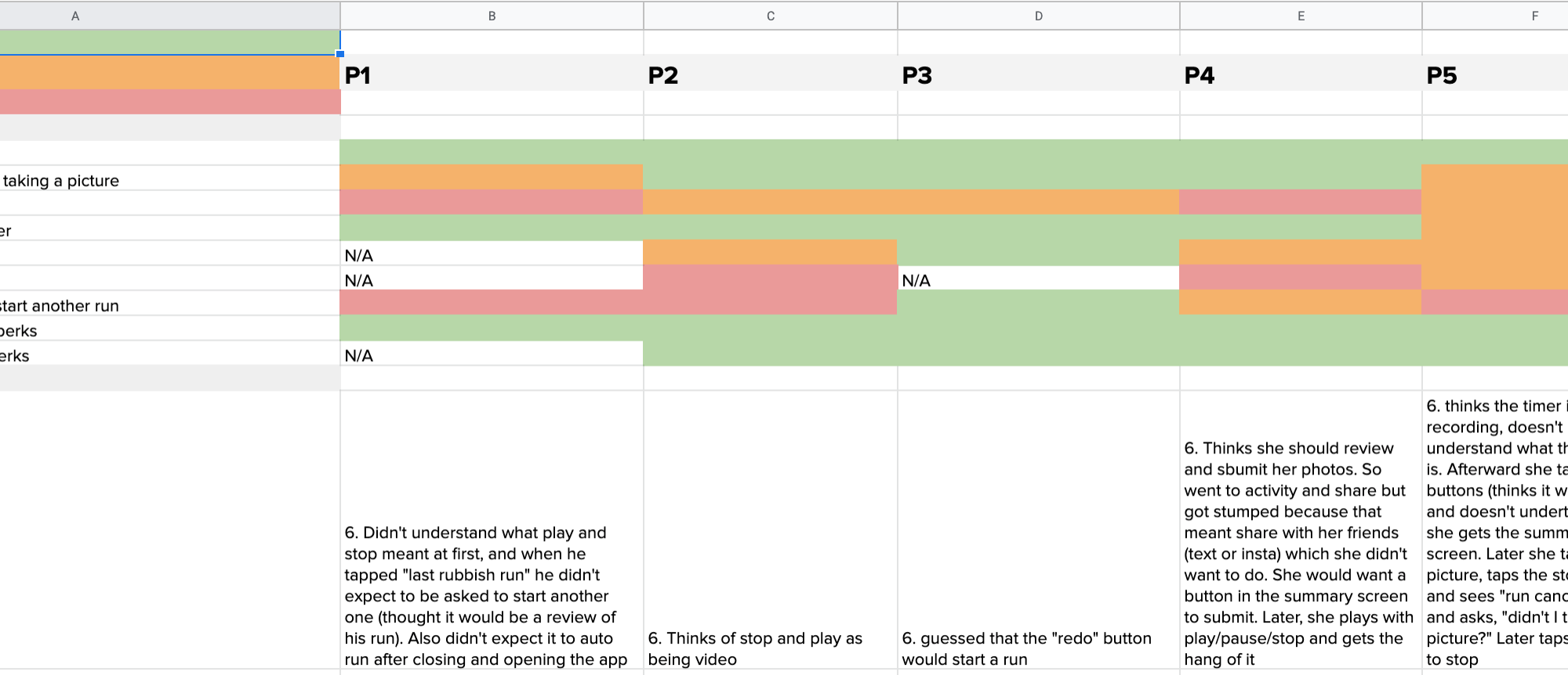
I created a stoplight chart to give the team a clear look at what in the app was clear for users and what was not. I put each key task in an Excel sheet row, and listed each participant in columns. I color coded each cell based on the nature of the task result for each user:

  • Red: Participant failed to complete the task
  • Orange: Participant was unclear of how to complete the task
  • Green: Participant easily completed the task

For each task that was either failed or unclear, I noted what the participant was thinking. View the full stoplight chart

a screenshot of an excel sheet with the stoplight chart

The stoplight chart explains what's working and what's not at a glance. There is further explanation of the problems in the chart as well as the presentation of findings.


Impact and Reflections

After wrapping up the research I shared the output deck in an hour long discussion. As an outside consultant tasked just with research, I knew I wouldn't be involved with pulling through the findings and insights in an ideation session. So my goal was to point out the critical app pain points, stimulate discussion around a few core themes, and leave the team with the output document they could refer to as they evolved their app.

I did make suggestions, particularly around how to restructure Rubbish Runs. I suggested structuring the photo collection into a camera-roll with an option to submit, and then making the timed Rubbish Run a separate mode for users.

I felt the insights and HMW statments in the deck were a great thing to leave the team with. It clearly described three core issues with users, and set up the team to ideate on their own as they moved forward.

The research could have been split into a larger generative research project around why and how people use apps, and then another evaluative project about the app flow and UI. An extended relationship with the team would have made this possible.

For example, during interviews I detected a thirst for litter statistics. In retrospect, I wish I had probed much more on this as it could have been fertile ground for ideation around content and features. By trying to fit so many learning goals in a hybrid session, I had to cut my exploration into why users were so interested in viewing aggregations of statistics about litter: could the app package and deliver litter data in way that is engaging, and possibly motivate users to track more?

Something I started wondering about as I interviewed was if this app resonated differently with people who were newcomers to their neighborhoods, versus those who were natives or have been in their neighborhood for a long time. Most of the participants were transplants that talked about how they embraced their neighborhoods, but on further probing signaled aspirations for a more optimal situation. Litter was part of a larger complex of anxieties including gentrification and complicated relationships to neighbors.

Future research subject: Emotions regarding litter among neighborhood natives versus transplants.


Back to Top