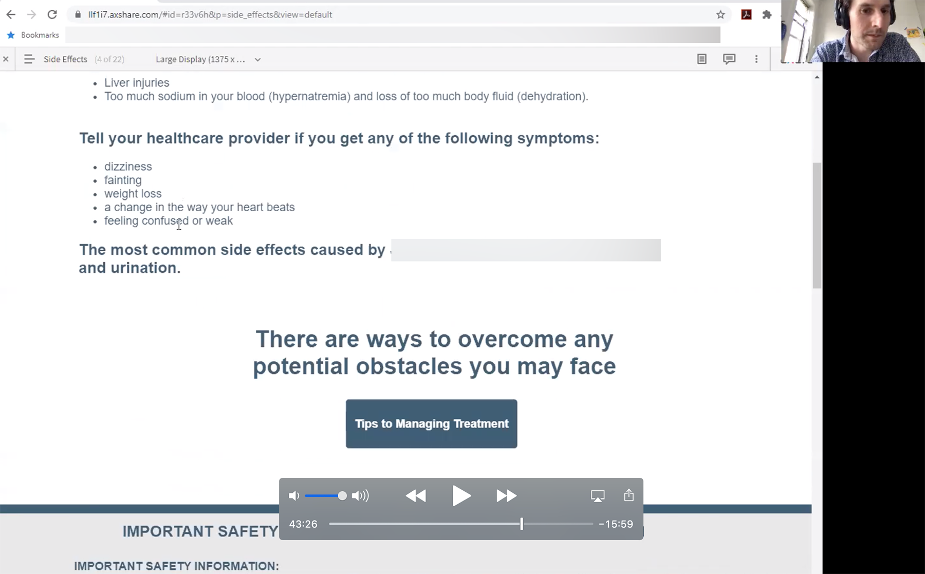
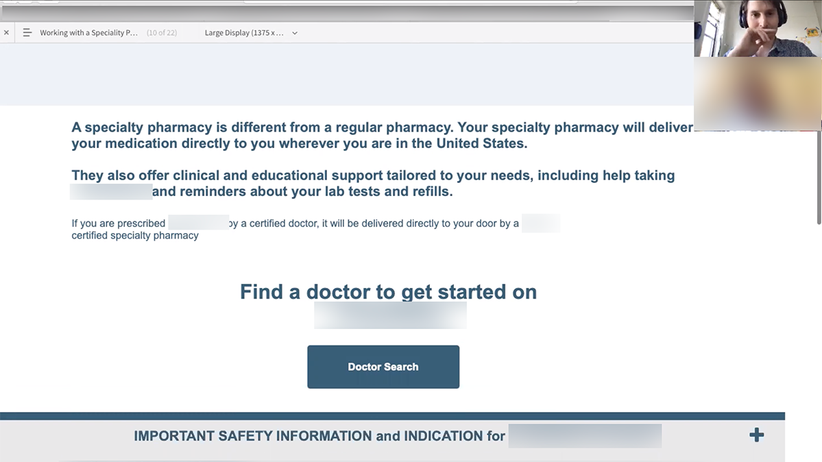
screenshot of a usability test with a website prototype and a thumbnail of Chris moderating the test

Uncovering How Patients Explore Information on a Kidney Disease Treatment Website


Our client was relaunching a brand website for their kidney disease treatment. They were aware of usability issues with their current site, and analytics showed low levels of visitor engagement.

My role was to educate the team on how user research could address KPIs and promote engagement. I ran ideation workshops and led the research activities including writing the discussion guide, moderating usability tests, and creating the output that inspired iteration on our original design.


Initial Ideation

To address the site's high bounce rate, I proposed usability testing the brand's current site to identify barriers users had finding information important to them. However, the client indicated that significant content changes coming in the site update would make the test findings irrelevant.

Despite wanting to uncover pain points on the current site before moving to ideation, the fervor for change was not to be denied! Rather than stifle momentum, I organized a workshop to let the ideas flow and extract what was really on our client's mind.

Seeing that the client was already simmering with ideas to solve their bounce rate problem, I organized a workshop to jump start the project, getting everyone involved and all the ideas visualized to discuss. I organized and helped run a two hour workshop that allowed the client and our internal specializations to pour out all the thinking.

The framework of the workshop was as follows:


  • null
    Encapsulate the Brief:
    Client and account team communicates the opportunities to improve and KPIs to the team

  • null
    Wall of Inspiration:
    Everyone shares an example of a website they like and why

  • null
    Individual Drawing:
    Everyone sketches 2-4 ideas for how we can better engage users. Ideas must address the goals described in the brief

  • null
    Group Sharing:
    Break into teams and share individual ideas. Collaborate on a master idea and sketch it out

  • null
    Present ideas:
    Each team presents their idea and teams evaluate ways this meets the objectives, and then opportunities to improve. Presenting teams cannot respond to opportunities to improve.


Lots of ideas surfaced for solving the high bounce rate, like end of page call to actions and shorter hero images that exposed page content.

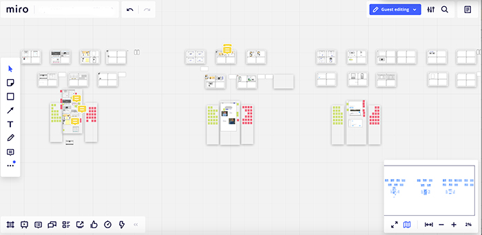
zoomed out screenshot of a Miro board with the team's drawings

Miro workshop aftermath

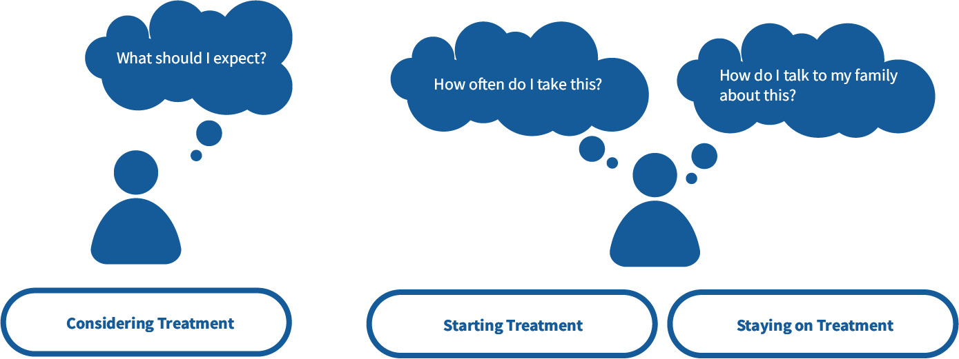
But a key topic in the workshop was how the site needed to address two major segments: patients that had not filled a script yet, and those who had and needed support. In our workshop we ideated on a site structure intended to address the information needs of these users. Our thinking was that structuring the site with sections labelled, "Considering BRAND," "Starting BRAND" and "Staying on BRAND" would facilitate users finding the information they needed and push down that bounce rate.

Graphic of patients asking questions like what should I expect? How often do I take this? And how do I talk to my family about this?

A "Considering Treamtent" section would address patients who were not on script, and "Starting Treatment" and "Staying on Treatment" sections would address those who filled their script

Research Statement and Goals

Would this structure make sense to patients? And how can the navigation and user interface promote exploration? In the client's words, "what can we do to make them click to the next page?"

Research subject:

Site navigation and exploration.

Research statement:

We want to evaluate our proposed site structure and navigation to learn if users can intuitively find content relevant to them so that they can rely on our site as an important part of their kidney disease journey.

Learning goals:

  • Uncover how users navigate from one page to another

  • Evaluate our homepage and main navigation to learn if users can find content relevant to them

  • Evaluate if users can complete key tasks and find key brand content

  • Evaluate the structure and value of key pages per segment: the product definition page and managing treatment page

  • Discover patients' goals exploring drug websites


Timeline, Methodology, and Recruitment

Our client was doing the development in house and required a lot of lead time, and there was an entire campaign being develeoped that would have to be integrated into the site imagery and copy. We had to shoe-horn research into the timeline.

My initial thought was to do a card sort because it would give us an impression of how patients conceptualize information regarding their disease state. It also didn't require any prototyping that would eat into the timeline.

But, our clients were intrigued by the prospect of watching users interact with all the user interface ideas that we explored during our workshop. So we aligned on usability testing of a prototype.

The client had access to patients from their marketing activities. The participant pool reflected two key segments: people on medication that needed support, and people that were not on the medication but were holding off.

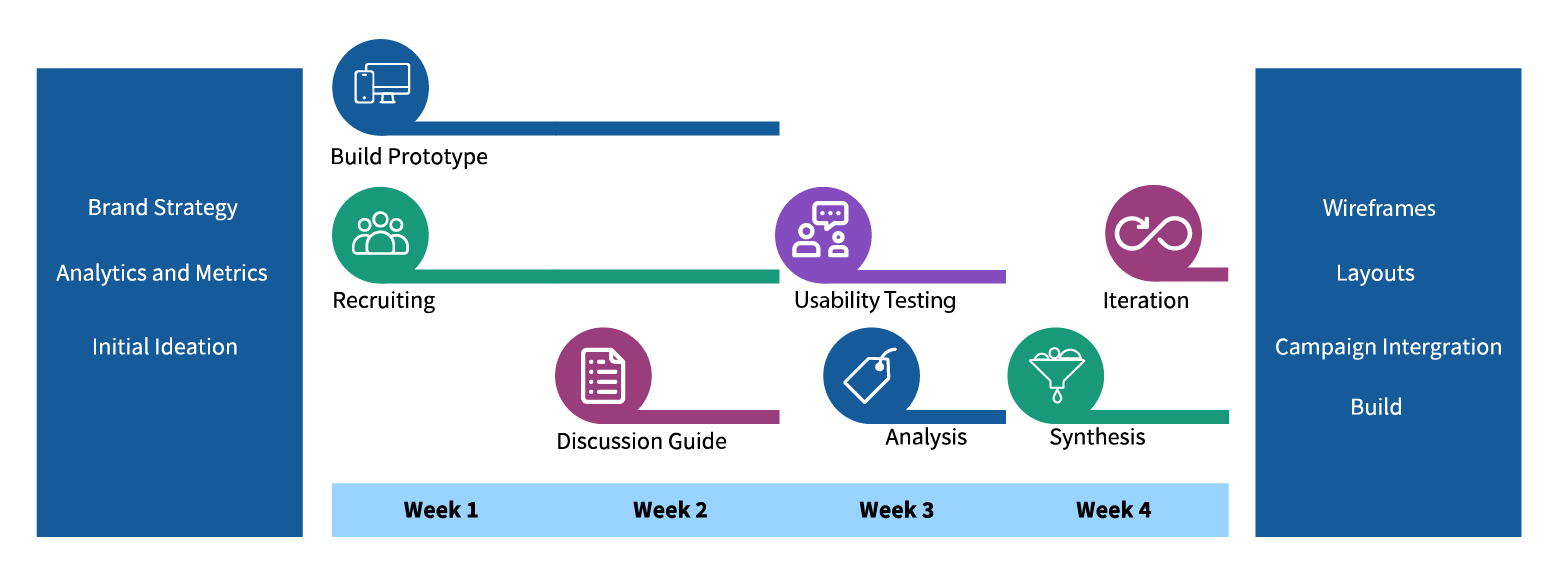
Graphic of the 4 week project timeline starting with brand strategy, analytics and initial ideation, and moving through prototype build, recruiting, writing the discussion guide, usability testing, analysis, synthesis and design iteration.

We fit the research into a 4 week timeline. There was a lot of time needed to integrate the campaign which was based on a messaging strategy, and the client's dev team required extra build time.


Discussion Guide and Testing

View the full Discussion Guide

We ran 12 sessions: 6 with patients considering treatment and 6 with patients already on treatment. Each session was 60 minutes. Half of the testing was with desktop computers and the other half was with mobile phones. All interviews were done over Zoom.

A few sample questions:

  • To discover patient goals exploring the site:
    Imagine you have returned from a doctor's visit and they had proposed you take [BRAND]. You go to the [BRAND] website to find information. What are the top three things you want to find here? Why?

  • To evaluate our homepage and main navigation:
    Earlier, you mentioned that you would would want to find [the first goal from the first question]. Show me how you would find that. Remember to say out loud what you're thinking and why you are going where you are going. Tell me when you're done.

  • Probing more specifically on the main navigation and key tasks:
    Looking at the top navigation bar, show me where you would go to find information about getting the medication?
Screenshot of a usability test (different than the one in the hero image) with the website prototype and a thumbnail of Chris moderating the test.

Usability testing was done remotely with Zoom


Output and Findings

Our output was split into two main documents: a topline report in a Word document that was handed off almost immediately after all the testing concluded, and a presentation of findings that was a 30 slide Powerpoint with video clips, presented to the client a week later in an hour and a half long readout.

The topline had our high level observations and immediate recommendations:

  • Regardless of the segment, participants wanted to learn about the efficacy data and side effects

  • The primary CTA in the hero image, "What is (BRAND)" was what participants wanted to clicked first

  • Representing these segments in the navigation did not help participants find what they needed. They were looking for specific things, and reflecting their stage in the patient journey in the navigation did not help them find what they wanted

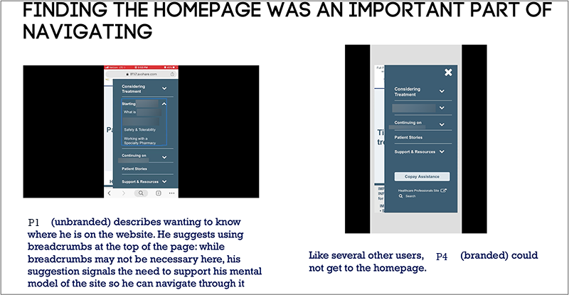
  • The homepage was important for navigating: After going to a page to find information, participants looked for the homepage to find different information and often expected a homepage icon they could click

  • The product definition page "What is (BRAND)" fulfilled participants' information needs, while the treatment support page did not because it detailed things they already knew about

  • Regardless of segment, getting the latest news and learning about other patients' experiences was important to participants

Our topline report went to the client immediately after testing as Word document, providing straightforward learnings and immediate actions we could take. A week later we provided a presentation of findings which included participant quotes and clips to create empathy in our clients, with descriptions of complex motivations that needed ideation.

The presentation of findings unpacked the points in the topline, providing some of the how and why behind it:

  • Because participants were interested in specific things, labeling the navigation with words that alluded to the segment rather than content made finding information difficult.
    Recommendation: Use straightforward language that clearly and directly identifies what is in each section.

  • Regardless of what stage of the journey participants were in, the brand website was interpreted as a place to learn about the treatment. Key questions were: Will it work? How does it work? What side effects are involved?
    Recommendation: have one clear entry point in the hero image that drives to this information and other high level information about the drug. Put other key patient information needs in the first dropdown of the site navigation because that was where participants most often looked to find things, regardless of how it was labeled.

  • After visiting a page, participants looked for the homepage or "main page" to find something else and scrolled to the top of the page they were on. They didn’t want to "get lost."
    Recommendation: provide a clear homepage link in the main navigation. While end of page CTAs can be used to promote exploration, we shouldn't rely on these to lower bounce rate.

  • Community is a big part of the patient experience, and influenced how participants interpreted information about the treatment. Participants indicated they spend time in close-knit Facebook groups and content from other patients holds a lot of value for them.
    Recommendation: provide support for managing treatment through the lens of other patients, and build on the already existing community section of the site.

Powerpoint slide with usability test screen shots and text recommending test participants' needs for a link to the homepage

A slide from the presentation of findings. Getting to the homepage was an important part of navigating.


Impact and Reflections

After our report we snapped back into ideation mode, workshopping new approaches to the parts of the site where we had key findings and insights:

  • We reconsidered the vocabulary of our navigation, moving away from a strategy of self segmentation and towards plainly stated descriptions that signaled what was in each section. We also added a home icon to the navigation.

  • The managing treatment section became much more detailed and specific to actual patient burdens, featuring patient quotes and links to videos in the community section

  • Our patient stories section was expanded into a stories library with child pages that had full stories. Videos were put in both the library and child pages as we learned that some users watch videos to relieve themselves of having to read, while others delay watching videos because they interpret text as being the main content and video as supporting details.

A critical shift in thinking was that representing user segements in the navigation did not help participants find the information they needed. Participants were in pursuit of specific things — side effects, how the medication works, "the positives and the negatives" — and navigation labels that identified with which stage of the journey users were on did not help them find these things.

Coming out of an ideation workshop about how to redesign our patient stories section, I created some wireframes to communicate our content structure for these sections, and from there the product team moved into applying look and feel and incorporating the campaign.
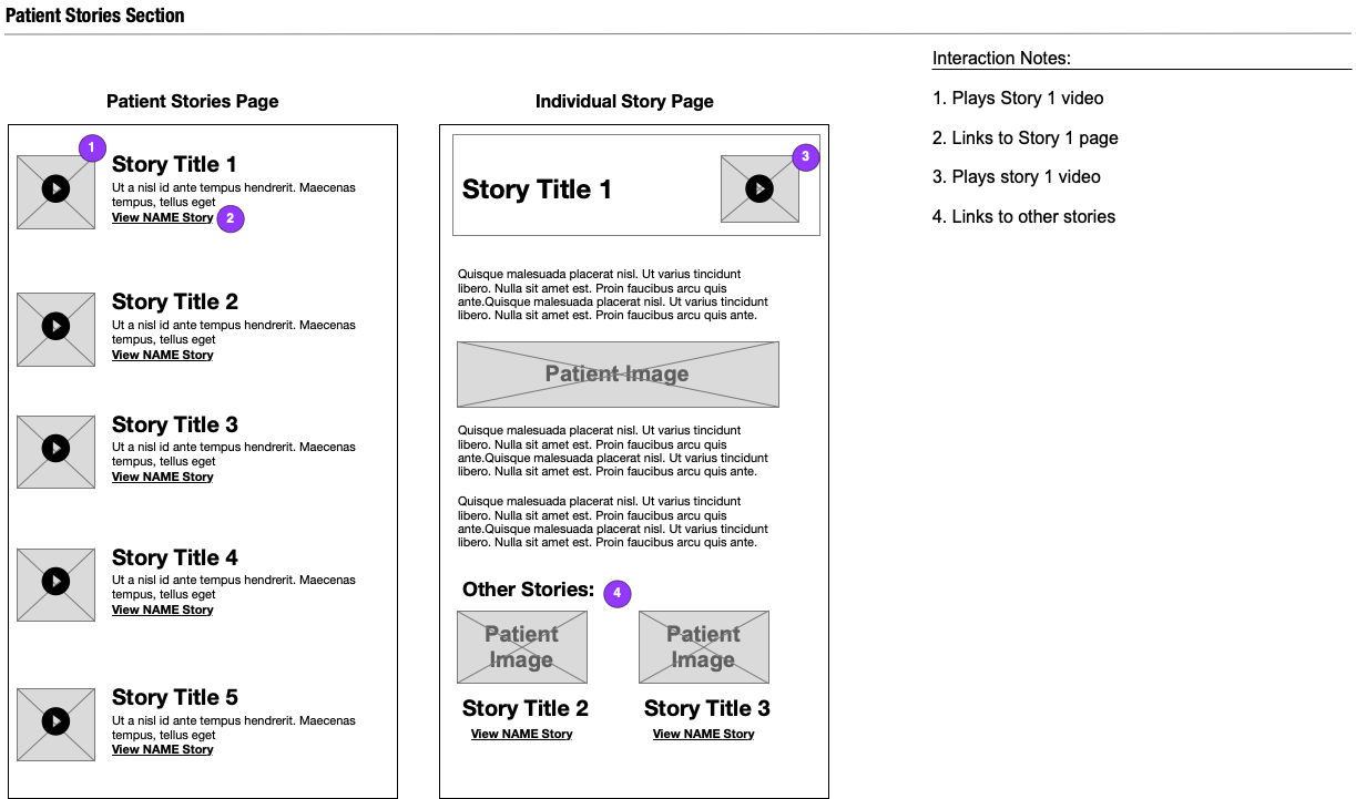
wireframe that shows how users flow from a patient story library to an individual story

Participants had different feelings about videos. Some were thrilled to be able to watch something as opposed to reading, while others saw videos as secondary to the text and indicated they might watch them after reading, or might not.

A lesson on our end was that we should have emphasized to the client how important it was that they attend the interviews, or at least watch the recordings afterward. The impact of hearing the participants wasn't felt broadly enough.

In regards to the testing, we could have made the tasks for participants already on treatment more relevant to them to get a more genuine read on how they felt about our content and what they were looking for.

Emphasizing or playing up the user interviews to the client may have made them more compelled to attend more of interviews and better fostered empathy, which would have made alignment on our design proposals smoother.

I sensed a future research subject emerged from the testing. I would really like to understand the importance of community in patients with rare diseases in a separate research project. We heard a bit about the kidney disease community from participants during testing, but didn't have the bandwidth in the hour-long sessions to probe.

Why do patients of rare diseases look to community? The answers we had for ourselves seemed too simple: that it's a rare disease and people want to find others like them. Why do they want to find others like them? What role does the community play in their disease state journey and how does it affect their decision making about treatment and disease state management? There were lots of opportunities to ask questions about things we thought we already knew the answers to, just not enough time.


Back to Top